Overview
Welcome to the sixth article of the 3x3 series – Confluence for Designers looking at the communication structure for medium and large organisations to achieve transparency, which leads to frictionless and smooth design delivery.
This article will be closing the Design pillar of three – Content [001↘︎], Experience [002↘︎], and Design [003↘︎]. This section has the most significant impact on the design integration within the product team. Here is where the design is correctly translated and paired with business objectives under the umbrella of a well-integrated design system well-documented rationale behind the design implementation.
“The purpose of the design section is to communicate design artefacts in a non-visual way to the wider community of professionals that uses the design outputs to generate the meaningful outcomes for the customer in the broader context of the business.” – Jiri Mocicka, 2016 – Sky
Does it mean we need to copy our drive or export every iteration into a separate PPTX and then upload it to Confluence so that everyone knows what we are doing?
Of course not. In the world of automation, scripts and algorithms are designers' best allies. To automate your daily routine, report less than 5% of your productive day (roughly 20 minutes). In comparison to hours spent on Slack to ask the most obvious question, “where is the latest screen?”
Especially when your design software is integrated with the company software ecosystem. Remote drive for daily backups, your screens are integrated with JIRA (or any other project management tools), and your work (Figma Boards) is linked to Confluence (or any other form of Wiki) to keep your colleagues fully informed. Then and only then, you focus five hours a day on creation.

What does the Design Section do?
Structure:
/ Brand Vision
/ Brand Strategy
/ Design Principles
/ Manifesto
/ Brand Bible
/ Design System
/ Feature List – feature 01, 02, 03 etc
/ Component List – component 01, 02, 03
/ Product
/ Alpha – Release
/ Beta – Release
/ CR1.0 – Release
/etc.
As you can see from the list above, the first item is the Brand Vision – every product or service must have a brand vision. Millions of designers move objects on the screens and ask your customer what they think and do not understand the Brand Vision through the research. Make all the information tangible, descriptive, easy to digest, and qualify. That way, your team grows wiser and makes smart decisions.
The same comes down to Design Strategy – how is it manifested internally and externally, and how does it affect the team and the product. The more specific you are in your definition better the outputs will be produced (not necessarily more), and desired outcomes will be achieved.
Design Principles align with CX principles – one that represents the desired behaviour (an action) under the emotionally led connection (expression or need). Inherently it focuses on principles defining the experience and overall guidance for the product. Interestingly enough, some proposition does not see it as vital to creating or having one. When asking different team members what the product stands for, I usually get ten different answers–go figure how these teams can even make it to actual release.
Brand Bible – replicates what the static predecessors did. Only in digital, live, constantly evolving form that is completely intertwined with your future product. Several companies have their own bespoke solutions and one that chooses to be fully integrated with other providers. The choice is yours.

Design System – most (none) designers think of the design system as a sketch file that orchestrates the rest of the files. Where in fact, the Design System is a logical response to a complex landscape of requirements and objectives in a visual form that is fully integrated across the business to deliver consistently and well thought through outcomes.
It has never been and design thing only.
Feature list – looking into the last state of the feature and its functionality. Let’s take the login feature as an example; the logging seems different in different releases. Supports other APIs and security protocols, integrate with different SSOs and evolves in UI. That’s all documented in “words” in the feature list.
Components List – This is a little easier as it represents the Design System. This part can be automated and changes less frequently than the above feature list. Think how many times you change the default button? The Component list, once created, can be maintained with little effort.

The Design Section Does not include.
Simply put, the designers do not like documenting. Therefore anything around documentation is quite a topic for more excellent debates. However, every designer expects other disciples to document so that we all can work simultaneously together – what a naive perspective, don’t you think?
Historically we have had PSD’s, AI’s, FireWorks, even InDesign files, and later Sketch to the least Figma. Outside of Figma, all the design apps carried out the challenges with versioning, and assets management, including measurements, just to name a few. (For those interested in running the documentation with these dinosaurs of the design industry, drop me the DM to discuss it separately – still possible if there is a discipline).
Three main pitfalls of using the design section for:
Asset’s delivery – With the arrival of Figma and the capability to share individual pages/views, it is relatively easy to document an entire pattern library in a few weeks. This completely cuts the middle man and the delivery of the assets in scale – while dealing with different language mutations, releases in different markets and content updated at the same time. Equally, delivering assets through any project management tool, including JIRA, is definitely NO.
Comments on Design – Equally, the comments on design moved from inactive to active places. Even though I see some traditionally set up companies still working in Sketch, Figma exporting a PNG and uploading on to an inVision, or miro to gather feedback from the team. This means running two software versions and two different places for comments, which could quickly multiply with Slack and three stakeholders giving additional input in other areas.

The ultimate destination for the product – the last and the most concerning pitfall is to overpower other disciplines and make the design section the most prominent. While this creates tremendous pressure on the design, the other disciplines stop contributing because the design always tent wins. An unhealthy dynamic leads to a derailed team and a lousy products in the customers’ hands.
In this case, everybody loses as no one really plays the part of building common knowledge with their peers. Design as a visual discipline should support all the others – to create diagrams, charts, reports and so on. That’s how you make the transition between all other departments and glue them together.
The design's biggest challenge is that it thinks it is in the centre of the business where in fact, it is in the middle of the process that makes the company the centre of excellence.
“Don't confuse legibility with communication.“ – David Carson
For more information, please join the Design at Scale™ Courses that explain the function, impact, and common pitfalls that can be avoided while implementing the DaS™ in your business.

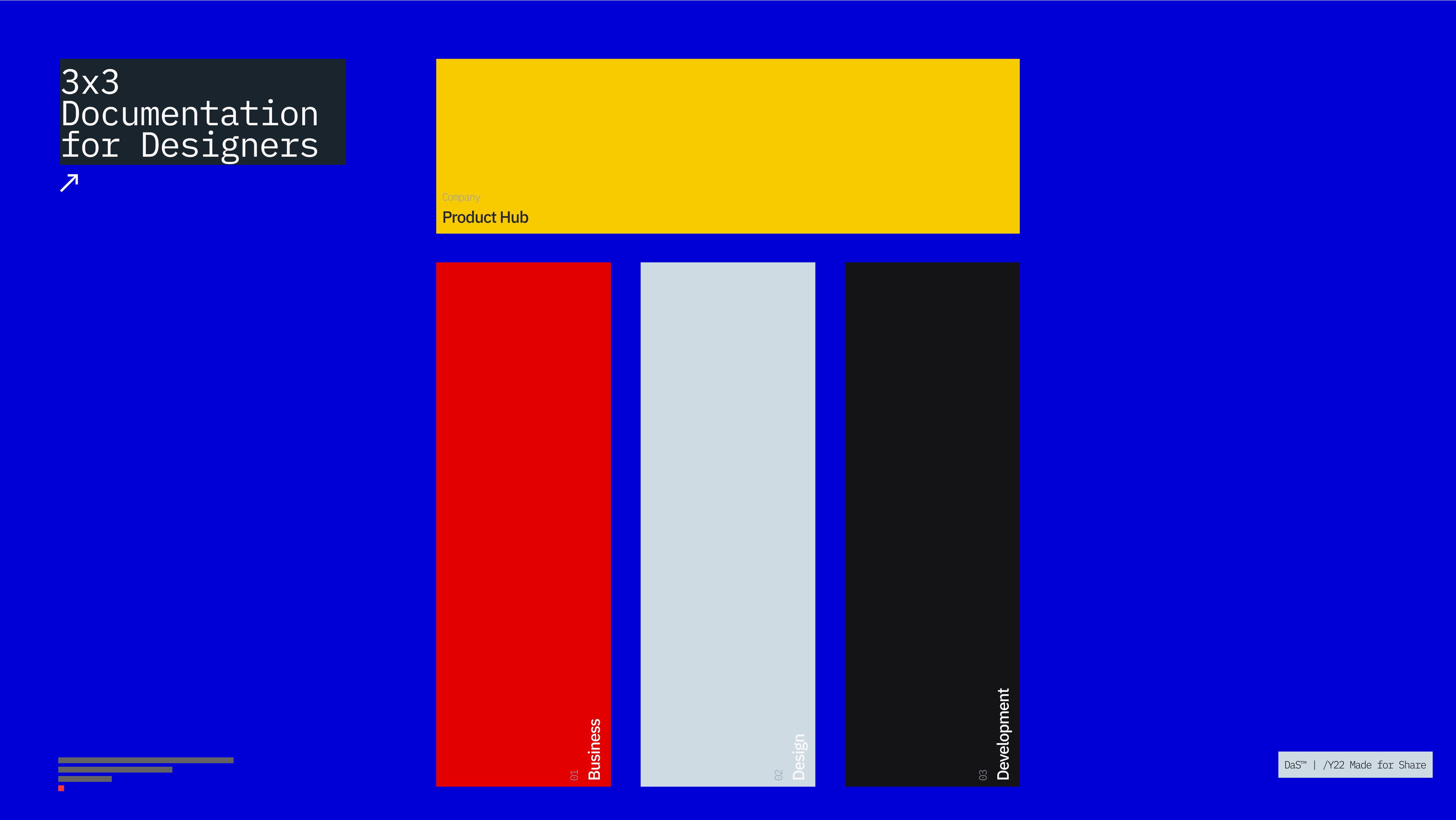
Structure
Let’s look at the Confluence structure in detail:
Business
1.0 — BRAND* Hello 2.0 — BRAND* Business 3.0 — BRAND* Research
Design
4.0 — BRAND* Content5.0 — BRAND* Experience6.0 — BRAND* Design
Development
7.0 — BRAND* Development
8.0 — BRAND* Releases
9.0 — BRAND* Integrations
I hope you’ve enjoyed the fifth article from 3x3 – Confluence for Designers. @designatscaletm is open to discussion about detailed implantation. The next article will focus on the Development section and all information related to coding, deployment and versioning.
See you there.