Overview
Welcome to the fifth article of the 3x3 series - Confluence for Designers looking at the communication structure for medium and large organisations to achieve transparency, which leads to frictionless and smooth design delivery.
The experience section helps synthesise the knowledge from – Hello [001↘︎], Business [002↘︎], and Research [003↘︎] in one place, expanding the footprint of the design team and creating a better connection between disciplines and departments that wishes to consume or interact with such information.
“The ambition here is to create an up-to-date, transparent, flexible and easily accessible place that allows the entire team to connect and stay in the know.” – Jiri Mocicka, Sky 2012
For some teams, the experience is everything, yet very few teams protect and leverage the power of the commonly shared knowledge.

Before we dive in, it’s important to say that the first three sections are the feed station for the other three sections to come. Think of the first three sections as a shopping basket that you can constantly access for the information and wisdom from the original idea of project initiation. Everything that happens in Content [004↘︎], Experience [005↘︎], and Design [006↘︎] sections is transformed through the design process to represent the future state and its iterations.

More than a decade ago, the titans of the R/GA UK Digital Innovation Agency of the Decade[007↘︎] – as many other agencies of that era, produced a tremendous amount of detailed documentation in PDFs.
Our motto was:
“Clarity, precision and strong point of view.” – Ilia Uvarov, VP, ECD of Design R/GA
The ambition went beyond the current need for documenting behaviours, navigation and behavioural models. It created the backbone for the project, management and the team to follow in times of resonance and despair. The clarity achieved by the structured document allows everyone to start from the same page. Precision in documenting every ambition made the R/GA outputs one of the best I have seen in over 20+ years of practice. The strong point of view communicated in such an organised manner made the RGA interaction team the best.
The scale and constant changes (client feedback and iterations) inevitably build the pressure between producers and interaction designers who tried to stay on top of the complex (technically speaking) documentation representing simple (profoundly well thought through) model for the product or service.
And that was the point where the agency and product team thinking divided. Despite progressive thinking and fast adoption culture, our debates about a less attractive and more functional approach were impossible to sell. Especially when we are inviting our client directly to a living document.
What back then seemed impossible is a decade later the reality. Product teams I have built around the propositions ever since were always defined around a joint (less attractive yet very functional) redistributed documentation model. This mode was called “the power of one” – One language, One Location, One team, One product that gave birth to Design at Scale™. [008↘︎]
Customer Experience is different for every business, team or product, yet many teams start with an approach one fit’s all. Is it Blueprint, Site-map, information architecture, user-journey and persona that fits to double diamond or is it where the project is and what we are building?
90% of projects I have joined (and assumed that the majority of designer agree) has no documentation that describes the business objectives, what problem are we trying to solve, and what experience are we trying to build for our customers?
That is why in the majority (8 out of 10) implementations, I thrive to build the centralised 3x3 proposition. By standardising each discipline's knowledge base and transparency about their contribution to the product or service, we enhance each project by 32%.[009↘︎]

What does the Experience Section do?
Structure:
/ Vision
/ Strategy –
/ Blueprint – Experience Mapping
/ CX Principles
/ Architecture –
/ Modeling – Navigation Model, Behaviour Model, Mental Model.
/ Feature List – feature 01, 02, 03 etc
/ Pattern Library + Component List.
/ Product
/ Alpha
/ Beta
/ CR1.0
Starting with a vision and a simple mission statement or, let’s say, a manifesto is the best thing – why do you do what you do. Include you, Words(wo)man, and you’ll see how crystalised experiences are created. (make sure that your outputs are well integrated with your knowledgebase) [010↘︎]
Strategy – focuses on the experience strategy; in other words, how things are connected and what makes sense for your particular customer. (ask yourself; does the strategy evolve or is it fixed – based on the answer choose the approach and channels that supports it)
Blueprint and other types of experience-led mapping should be in one place so that everyone can access them within one or two clicks. In my case over the decades I have moved from Confluence (working for product companies) to InDesign documentation exporting tons of PDFs (working for agencies) back to Confluence – haven’t found a better tool yet. (meaning combination of Figma to Atlassian) [011↘︎]
The Information Architecture section combines all thinking behind the technical representation of iA and a sort of content architecture. I’m preparing another series of articles looking into specific outputs in relation to Design at Scale™ [012↘︎].
Feature and Component list utilised the full knowledge of these attributes and expected behaviours that all need to possess. What is important to mention here is that the focus is not on the quantity to document everything; instead, it focuses on clarity and relationships between features (creating desired behaviours) and components (holding + dealing with different data).
These pages are constantly updated where only the latest states that are most relevant are available. Essentially, it allows the business and engineering to see the progress in real-time. Contribution is encouraged throughout the whole development cycle. Depending on delivery model BDD[013↘︎] or TDD [014↘︎], we include User Testing Scenarios and Design Sprint Knowledgebase.

The Experience Section Does not include.
In essence, the Experience section is a living, breathing organism to any project or service. Any designer needs to maintain this knowledge base to the highest possible level and refer to it at any time when a question about specific topics is raised.
The complete opposite picture of this so-called experience knowledgebase is Slack combined with a remote drive, full of documents that communicate different things without ever referring to another. It is essentially a dump-yard of files and images that are remotely related and mostly outdated as the team spends more time chatting in specific Slack channels rather than creating or documenting the proposition.
Three main pitfalls of the Experience Sections are:
Static / embedded files – We have touched on this topic in previous articles. The Experience designers create many artefacts in different software mainly based online. It’s been increasingly difficult to find what is the latest version of the site map on the miro board or mural service design workshop that unified the Service design Blueprint. Presenting a static file diminishes the capabilities and potential re-usage of such artefact in future iterations to come.
Information duplicity – The statistic shows that even one person has roughly 20-30% of duplicated content. Think of your photo on your phone for the moment, multiple drives and backup solutions. Information duplicity is a real threat to any productivity as the file, information or decision you are looking for can be (and most likely is) replicated somewhere else.
Amongst other factors, this makes you and your team 20% less productive. A well-defined naming convention[015↘︎] across all your files [016↘︎] is one way to avoid that.
Recreation and misalignment – In the medium to large-size teams, certain artefacts' recreation is inevitable. Think of the business containing five units and operating in different sectors, having a different voice and visual language tones, yet a common experience model. To align such a proposition is a real challenge for any design director yet for the design practitioner.
We often hear:
“We often hear; My team is too busy to unify and standardise, we must deliver first! ,yet the opposite is true.“
For more information, please join the Design at Scale™ Courses that explain the function, impact, and common pitfalls that can be avoided while implementing the DaS™ in your business.

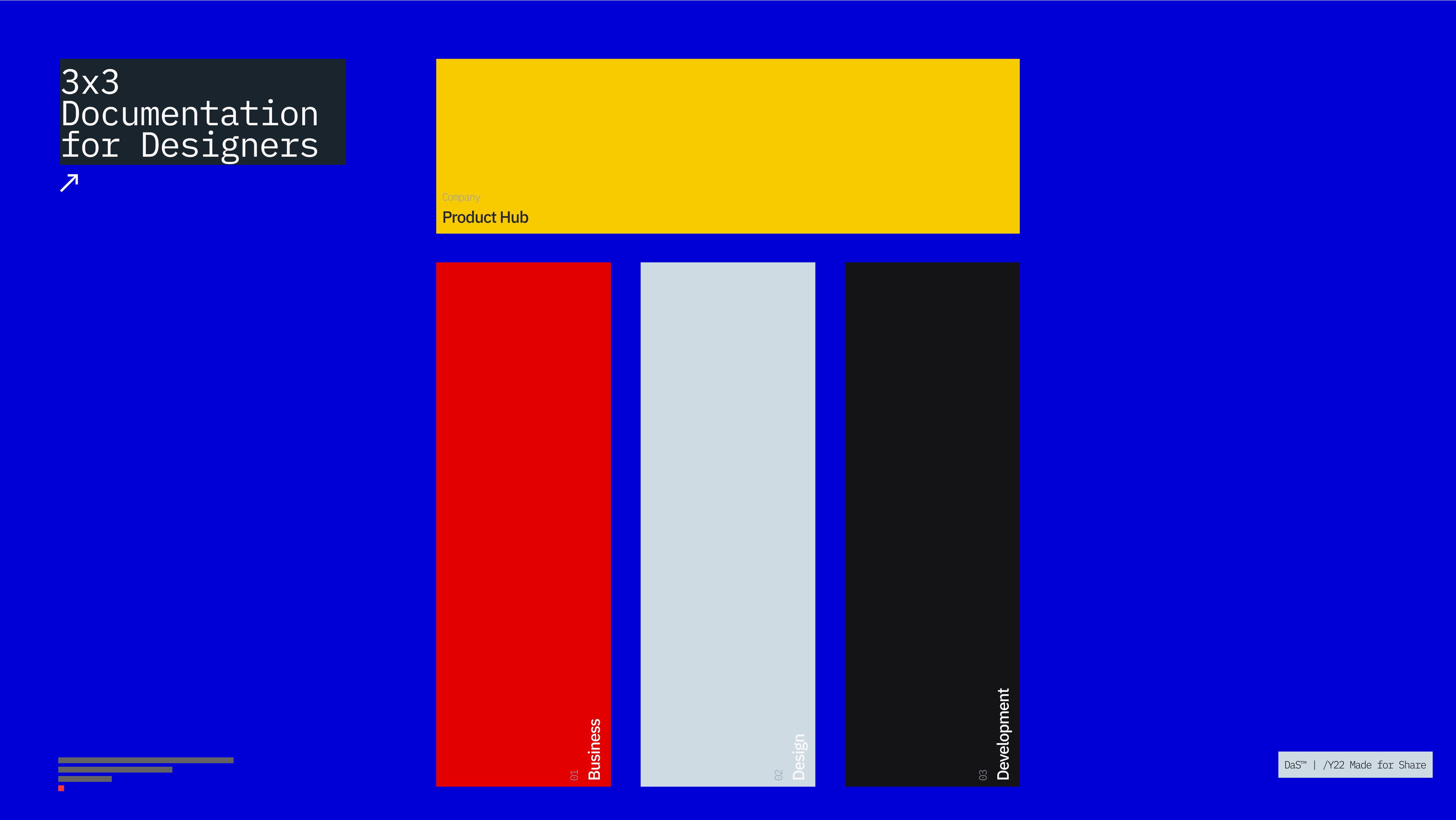
Structure
Let’s look at the Confluence structure in detail:
Business
1.0 — BRAND* Hello 2.0 — BRAND* Business 3.0 — BRAND* Research
Design
4.0 — BRAND* Content5.0 — BRAND* Experience
6.0 — BRAND* Design
Development
7.0 — BRAND* Development
8.0 — BRAND* Releases
9.0 — BRAND* Integrations
I hope you’ve enjoyed the fifth article from 3x3 – Confluence for Designers. @designatscaletm is open to discussing implantation in detail. The next article will focus on the Design section and all information related to the design function.
See you there.