;

Be Cool, Get Nowhere …

Featured Image

Not every generation of designers is made equal.

The Bauhaus movement, born in the political tension of interwar Europe, gave us the first modern design revolution. It was minimalism with ideology - clarity as an act of resistance. After the war, as economies recovered and optimism returned, abstraction and pop-art replaced propaganda. The designer’s task shifted from persuasion to aspiration.

By the time our parents were “keeping up with the Joneses,” design had become the language of desire. Posters sold dreams. Packaging sold status. Media multiplied. The role of design expanded from craft to culture.

Then the internet arrived - and with it, to put it frankly, chaos. 

In the late 1990s, most people weren’t ready for digital interfaces. Websites were labyrinths of novelty and frustration. Slow dial-up speeds and bad usability turned curiosity into abandonment.

This failure was also our opportunity. Out of it came an obsession with usability, accessibility, and human-computer interaction. The term user experience began to take shape.

Suddenly, design wasn’t just about how things looked; it was about how they worked.

During the dot-com boom, the industry professionalised overnight. The single title “designer” splintered into a dozen: UI, UX, IA, IxD, prototyper, creative technologist. The design studio became a microcosm of the organisation itself - a network of specialists instead of a single creative brain.

BOK – Be Cool, 
Get Nowhere.
BOK – Be Cool, 
Get Nowhere.

But with scale came fragmentation.

Digital aesthetics evolved quickly: simpler layouts, readable screens, fewer distractions. Designers traded decorative flair for functional focus. Yet every technological advance brought new complexity. Flash promised interactivity but broke accessibility. The director dazzled but failed to scale.

We learned the same lesson over and over again: novelty doesn’t equal progress.

When broadband arrived, businesses discovered that websites weren’t marketing accessories - they were storefronts. Brand consistency across every digital touchpoint became the new holy grail. Out of that need, design systems were born.

They were meant to unite. To create coherence at speed.

But somewhere along the way, “scale” became a vanity metric. Companies equated size with success - the more designers, the better the design. Rockefeller would have smiled at the logic: growth for growth’s sake.

Design was never supposed to be about headcount. It was supposed to be about alignment.

The modern UX industry, for all its frameworks and empathy maps, often confuses collaboration with clarity. Teams grow larger but not smarter. Titles multiply faster than outcomes. The more we try to structure creativity, the less creative we become.

We’ve turned design into a factory line. This, ironically, the very model it once sought to escape.

There’s nothing wrong with wanting influence or specialisation. But when the field fractures into functions - UX, UI, research, service design, ops - we also risk losing the whole picture. Design stops being a point of view and becomes a process chart.

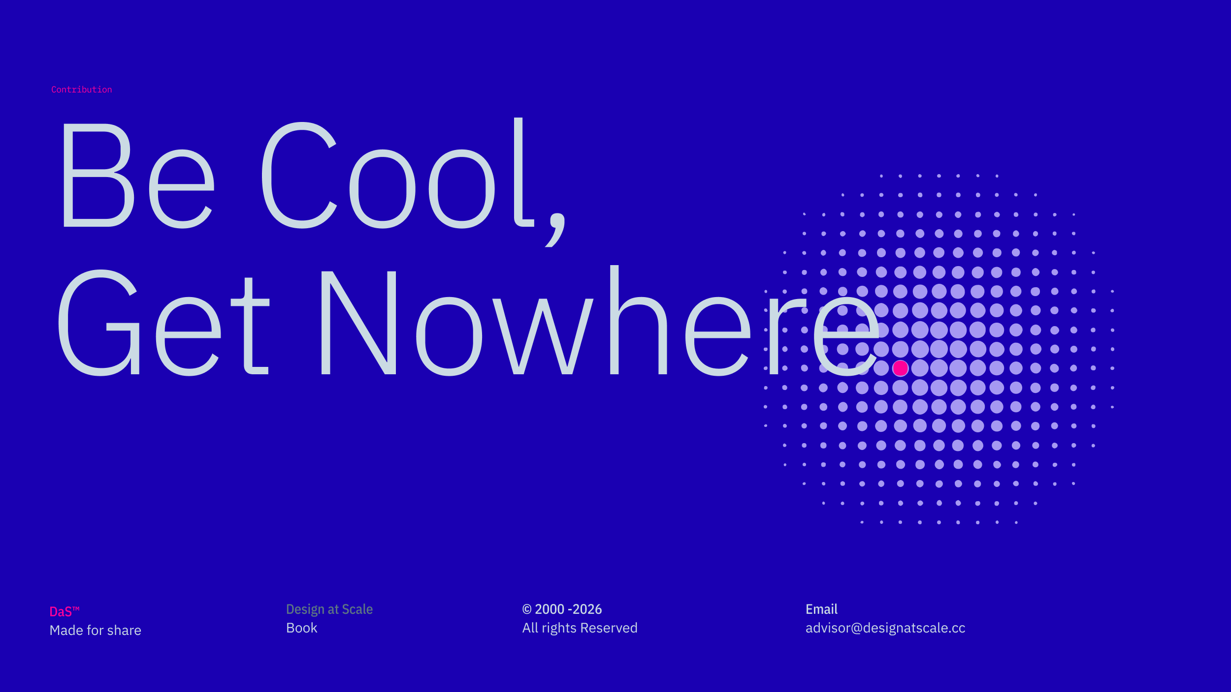
So, let’s be honest: “cool” isn’t working.

Cool makes us look busy. Cool fills portfolios and decks. But cool rarely changes the system.

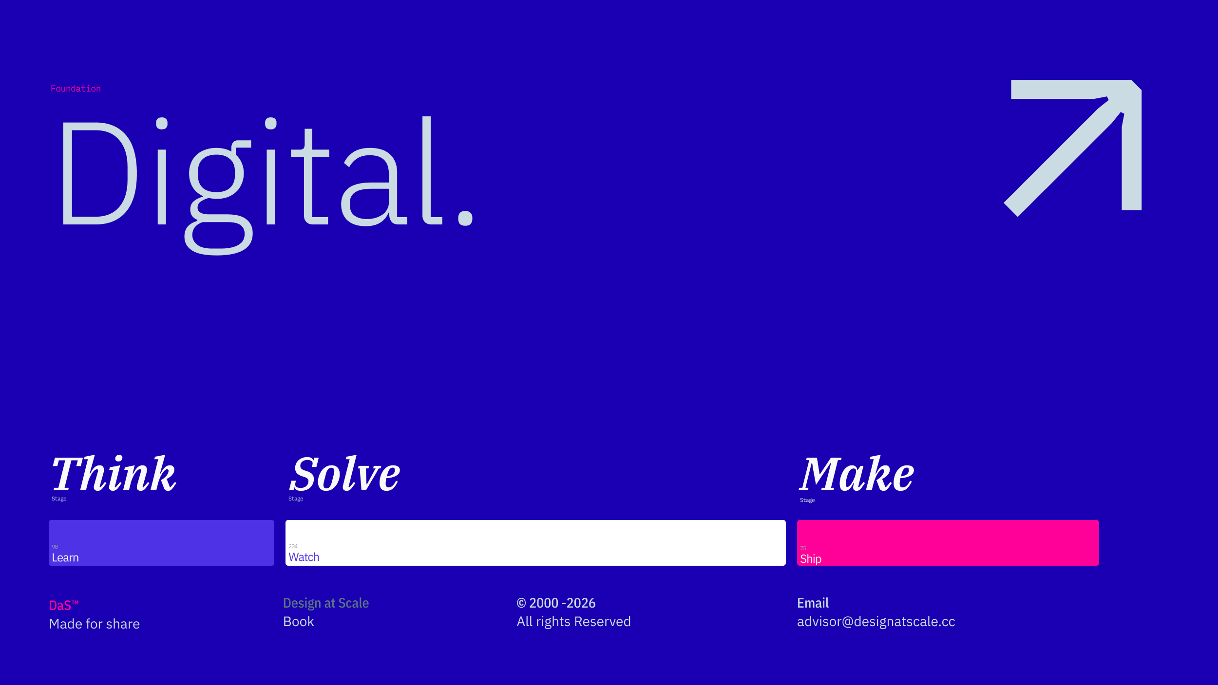
Real impact comes from the unglamorous work of integration. The quiet discipline of connecting dots across messy organisations. Scale, after all, isn’t about how many people you have. It’s about how well they move together.

Design at Scale™ Your Story Matters

Happy scaling through design!

Hey, I’m Jiri Mocicka.
London-based Product Design Director, Trusted Advisor and Author of Design at Scale™. The method that empowers individuals to shape the future organisation through design.
If you have a question, join our Community and reach out to like-minded individuals who scale design propositions. An online Academy can help you to define teams of 01, 10, and 100, and 1% supported by Grid Magazine and Supply section, where we bring more insights weekly on how to become a design leader in your Agentic Organisation

Author's Name

AVATAR

inResearch

42

inWriting

70

Released

235
EMT

Related.

Featured Image
In early 2026, we all saw some experiments and prototypes in which one node connected to another could transform an image into a series …
January 6, 2026
 · 
6 min read
Featured Image
Design has never stood still. Over the past century, it has transformed again and again. Each shift in form or function reflects a deeper …
January 1, 2025
 · 
4 min read
Featured Image
Since the early 2000s, the demand for designers has surged. As technology moved fully into digital, designers were forced to evolve with it. We …
January 8, 2025
 · 
3 min read
Featured Image
Remember the Design Director I mentioned earlier? The one who led by vision, not by title? They didn’t manage people - they managed direction. …
January 29, 2025
 · 
3 min read
Featured Image
Most designers spend 80% of their time promoting their skills and only 20% sharpening them. It’s as if we’re all waiting for a design …
February 5, 2025
 · 
3 min read
Featured Image
In the early 1900s, a cobbler knew every curve and stitch of the shoe they made. They built by hand, understood materials intimately, and …
January 22, 2025
 · 
3 min read
Featured Image
Welcome to the Jira for Designers series brought to you by Design at Scale™ – Academy. In a previous article, we discussed Design planning(↘︎Link) and …
March 27, 2023
 · 
6 min read
Featured Image
The most common interview opener is also the most commonly botched. Not because candidates lack a wealth of experience or confidence, but because they …
January 3, 2021
 · 
7 min read
Featured Image
Aligning Human Senses and Technical Communication to Unlock Enterprise Scale In a quickly evolving global corporate environment, cross-functional alignment is the ultimate metric of …
April 6, 2026
 · 
4 min read

GRID Magazine

Explore OUR 
Articles

Every week we bring set of stories reflecting on communication, operation and technology.

Newsletter

Subscribe.

We share our 20 years of experience in creating, managing and scaling products and services that allow individuals to shape organisations through design.

Design at Scale™

LINE_MAGENTA_050_301

Categories

LINE_MAGENTA_050_301

Data

LINE_MAGENTA_050_301

Share

Internal

Collaborate

Resources

IBM PlexSan
Regular
Charcoal

Design at Scale™ is defined by three models, which form the Method. Each model operates in a different part of the business and collects and informs parties on design and engineering decisions that have a direct impact on the delivery.

All brands and trademarks presented on the Design at Scale™ website are owned by their relevant companies or agencies. The projects represent collaborations between designers, developers and product owners. Do not copy or publish any of the projects shown here without written approval from Design at Scale™ (alternatively GIVE™, 9V™) and/or relevant companies and agencies.

SOC_Twitter
SON_LinkedIn
SON_Instagram
SOC_-Medium
View