;

Y24 Nº50 GRID Mag – Don’t be the best UI Kit in the town

Featured Image

Dear (none)Designer,

Welcome back to the fiftieth Design at Scale™ Newsletter – where we explore innovation and how design sparks real change in large organisations and agencies.

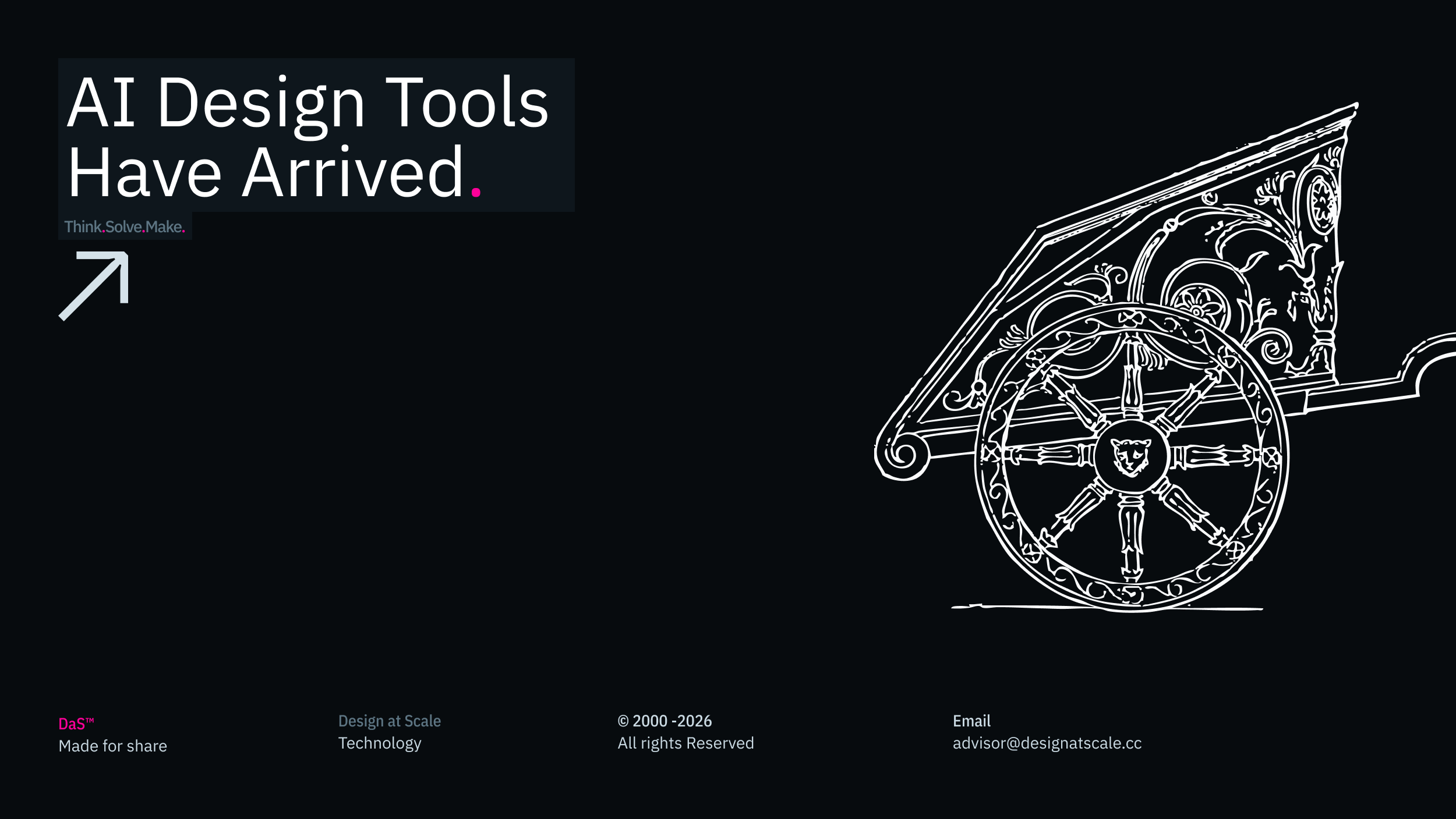
With the arrival of Figma in 2015, the world discovered that user interfaces could be driven by UI kits that define global properties across multiple products. This inspired thousands—if not millions—of agencies to build their own UI kits as part of their extended offerings.

Designers spent countless hours crafting UI screens and creating mirror files to document every possible variant of a single component, showing how each could be used across websites, applications, or services.

As a result, clients often received two files: a UI reference for the site or application, and a UI kit representing every possible variant—many of which were never used. Literally millions of content layers were passed between agencies and clients, with most remaining untouched.

Regrettably, clients would often plead, “Simplify, simplify, simplify your design system! We don’t need all these variants.” Yet agencies continued producing hundreds of variations for each component, trying to showcase creativity instead of understanding that a well-designed, flexible component could cover all these needs with far less complexity.

As time passed and technology evolved, building new components became a matter of copy and paste. Replicating entire UI kits became the norm, rather than thoughtful design.

The result? These sprawling UI kits became nearly impossible to manage, marking an era of design system saturation. Seasoned design professionals noticed this trend. The media even began to discuss the 'death of design systems,' questioning how companies could maintain a consistent visual language in kits that few could actually navigate or use.

Building the 'best UI kit in town' often became a solo exercise for design system architects, protecting something only a few could appreciate. After years spent on design systems for leading car manufacturers, retailers, and telecoms—some with millions of layers—we realized this wasn’t the solution we thought it would be.

Then came primitives—simple, reusable building blocks—which completely shifted the industry. The age of endlessly copying and pasting components was over, as new creative technologies took center stage.

Whether we like it or not, design systems may no longer be the sole domain of designers. In just a year, organizations experienced staggering changes. Automation accelerated the process so much that many design tasks became commoditized.

While most panicked, a small but visionary group saw opportunity. By integrating design with business and development, they began to build an ultimate bridge—one that gives design a seat at the table and true ownership of the product journey.

Despite negative press and predictions of doom, we’re seeing more designers founding companies, embracing agility by creating automated products and services, and playing an even greater role in driving business success.

If you want to join this revolution, start learning to code. Understanding the basics—like XML, JSON, CSS, and React components—is becoming essential for modern designers.

In conclusion, the era of the massive UI kit is over. Welcome to the age of the automated, organized and integrated design system.

For more information, please visit Designa at Scale™ – GRID Magazine, where you can find additional relevant articles that explore high-performing teams, self-organising teams of 001, teams of 010, and teams of 100 that deliver the value proposition within a product-led environment.

Happy scaling through design!

Hey, I’m Jiri Mocicka.
London-based Product Design Director, Trusted Advisor and Author of Design at Scale™. The method that empowers individuals to shape the future organisation through design.
If you have a question, join our Community and reach out to like-minded individuals who scale design propositions. An online Academy can help you to define teams of 01, 10, and 100, and 1% supported by Grid Magazine and Supply section, where we bring more insights weekly on how to become a design leader in your Agentic Organisation

Author's Name

AVATAR

inResearch

42

inWriting

77

Released

230
EMT

Related.

Featured Image
Welcome to the Jira for Designers series brought to you by Design at Scale™ – Academy. In a previous article, we discussed Design planning(↘︎Link) and how the basic structure of design operations can improve organisational …
 · 
2023-03-27
 · 
6 min read
Featured Image
The most common interview opener is also the most commonly botched. Not because candidates lack a wealth of experience or confidence, but because they fundamentally misunderstand what is being asked of them. Master this …
 · 
2021-01-03
 · 
7 min read
Featured Image
Aligning Human Senses and Technical Communication to Unlock Enterprise Scale In a quickly evolving global corporate environment, cross-functional alignment is the ultimate metric of operational achievement. Yet, semantic and physiological noise creates friction at …
 · 
2026-04-06
 · 
4 min read
Featured Image
Welcome back; this article is part of the series called DaS™ – Naming convention. The previous article explored the history and mental models behind sorting information in digital space. This article will discuss how …
 · 
2020-05-11
 · 
6 min read
Featured Image
Welcome back; this article is part of the series called Naming convention. The previous article explored the history and mental models behind sorting information in digital space.[001↗] This article aims to discuss the naming …
 · 
2020-05-04
 · 
6 min read
Featured Image
We’ve all been there. Someone, most probably a boss, asks us to find the latest email or Miro [001↘︎] board or simply share a file created a while ago, and we struggle to find …
 · 
2020-04-27
 · 
5 min read
Featured Image
Welcome back; this article is part of the series called Naming convention. The previous articles explored the impact of folder naming conventions. This article discusses the naming convention inside the CX and UI files …
 · 
2020-04-20
 · 
5 min read
Featured Image
The tech industry, and design within it, often perpetuates a comfortable myth that every designer needs a single, seasoned mentor to navigate their career in constant change. That is why thousands of designers turn …
 · 
2021-08-01
 · 
6 min read
Featured Image
Welcome to the Design at Scale Method series. Today’s article has no more minor ambition than to connect, empower and unify all product designers under a simple Manifesto, which easily translates the value of …
 · 
2021-02-17
 · 
3 min read

GRID Magazine

Explore OUR 
Articles

Every week we bring set of stories reflecting on communication, operation and technology.

Newsletter

Subscribe.

We share our 20 years of experience in creating, managing and scaling products and services that allow individuals to shape organisations through design.

Design at Scale™

LINE_MAGENTA_050_301

Categories

LINE_MAGENTA_050_301

Data

LINE_MAGENTA_050_301

Share

Internal

Collaborate

Resources

IBM PlexSan
Regular
Charcoal

Design at Scale™ is defined by three models, which form the Method. Each model operates in a different part of the business and collects and informs parties on design and engineering decisions that have a direct impact on the delivery.

All brands and trademarks presented on the Design at Scale™ website are owned by their relevant companies or agencies. The projects represent collaborations between designers, developers and product owners. Do not copy or publish any of the projects shown here without written approval from Design at Scale™ (alternatively GIVE™, 9V™) and/or relevant companies and agencies.

SOC_Twitter
SON_LinkedIn
SON_Instagram
SOC_-Medium
View